Identity and Branding
We offer full branding packages for your organization, new product, or service offering launch. Often the place to start is with a market analysis that determines, among other things, your core benefits and how you're perceived against your competitors. A critical component of branding is the identity system – visual components such as logo, tagline, letterhead, or signage paired with style guidelines to ensure the corporate image is cohesive and consistent. We’ve included a few examples below.


A New Day at United Regional
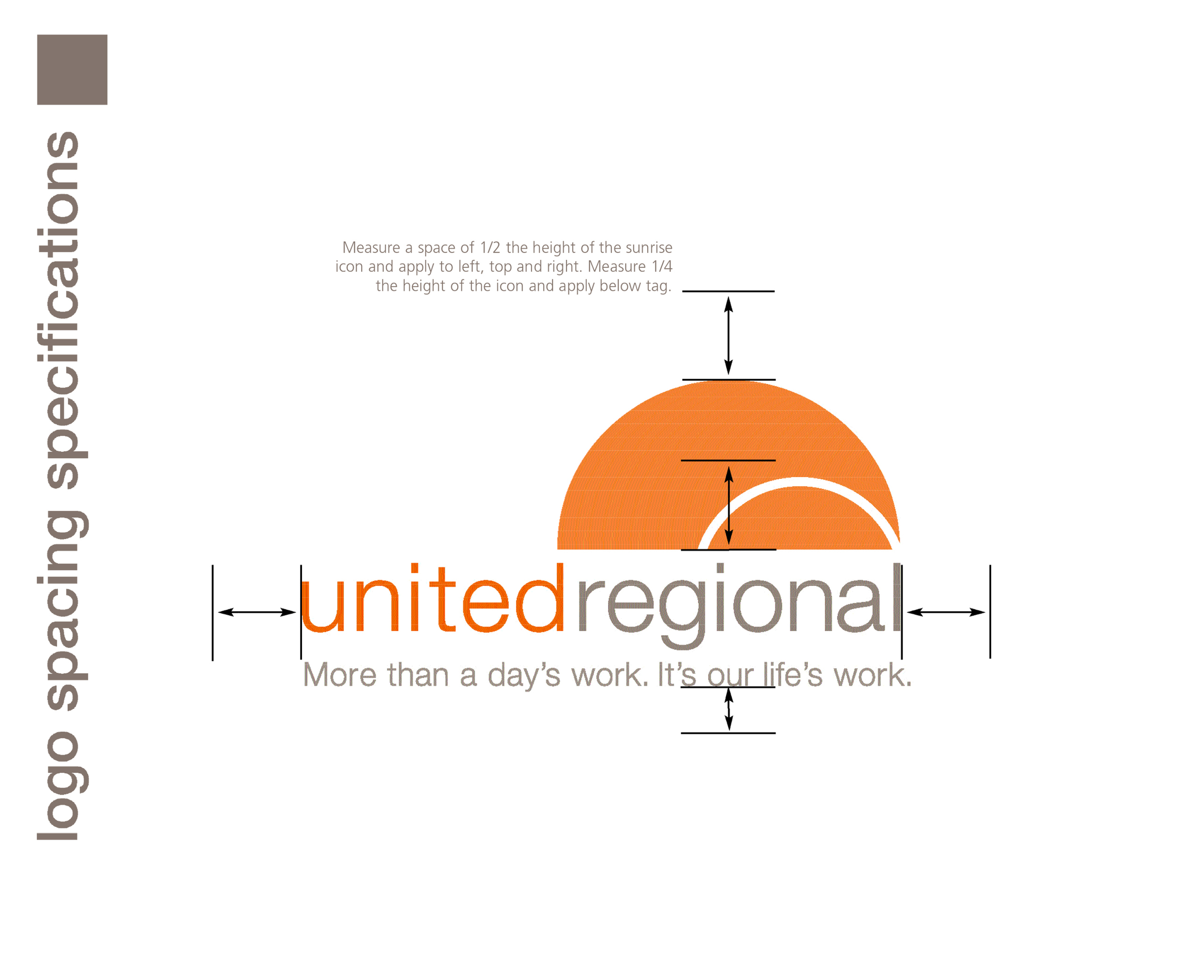
When our principals started working with United Regional in 2006, their first step was to elevate the brand with a brand makeover that included a standards guide to keep the identity consistent; even including architectural recommendations on signage. The rising sun icon and tagline were created to reflect a fresh new era at United Regional. For the rest of the story see United Regional.
Carter BloodCare Re-brand
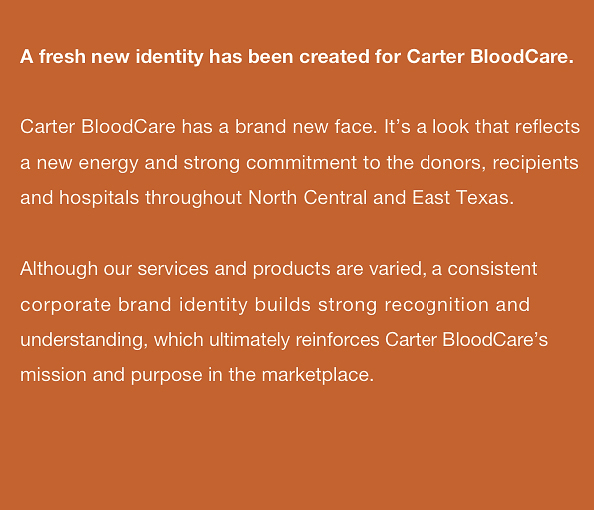
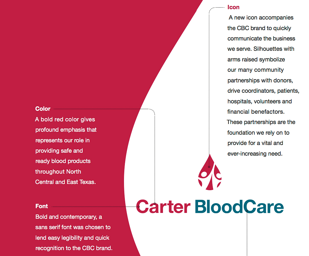
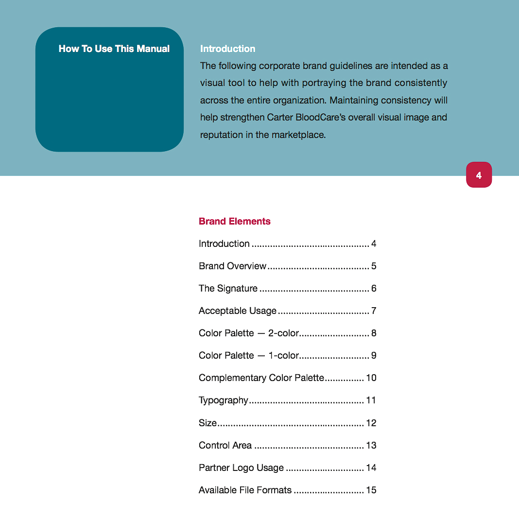
A not-for-profit community-based blood center, Carter BloodCare is the primary provider of blood components and transfusion services for approximately 350 Texas healthcare facilities. To the left, we've included a few pages of the brand standards guide we created to solidify their brand as well as their various donor enrollment programs. Find out more at Carter Bloodcare.
First 3 Years
First 3 Years works to give every child a great start. We worked to give this organization a great start by creating for them an eye-catching new logo when they changed their name. The hand-in-hand icon quickly communicates the organization’s mission which is to inform and train Texas childcare workers about the importance of early childhood brain development.
A Galloping Good Start
ManeGait, a new, nonprofit therapeutic horseback-riding center, got off to a galloping good start beginning with the logo, tagline, letterhead and website. Click to learn about our ride with ManeGait.
